WW Bridal
WeddingWire user research for new wedding dress website
Overview
WeddingWire is a huge name in the bridal industry, known for providing resources and guidance to engaged couples and businesses in the industry with their large directory of wedding professionals, registry and website services, to name a few. The concept for this project was to create a new product for the popular wedding company that helps users have a more positive wedding dress shopping experience, which is commonly known for being stressful and daunting.
Problem Statement
In the modern world of wedding planning, picking out the perfect wedding dress can prove to be particularly overwhelming for many brides. Industry experts say that most brides try on four to seven gowns, but if they try on more than ten, it can lead to confusion. Not to mention the wide array of cultural pressures. Wider use of technology has helped to produce online services meant to help alleviate some of the wedding planning stress, including the ability to shop for wedding dresses online. However, with 60k+ couples married every year in the United States, there is certainly a lot more room to raise the user experience standards in the industry.
Project Goals
● Create a new child site under the WeddingWire.com family, “WW Bridal”
● Design a centralized place for wedding dress research & planning
● Provide a personalized wedding dress dashboard for an immersive experience
● Website mockup deliverable
Guiding Question: How might we improve our users’ wedding dress shopping and researching experience?
Role & Responsibilities
● UX Strategist
● UX Researcher
● UI Designer
Target Users / Audience
The target users for project are the brides, themselves, as modern wedding morality tells us that the top priority of any dress shopping experience should be the dress wearer's satisfaction. More specifically, I will be targeting the users of the WeddingWire.com website.
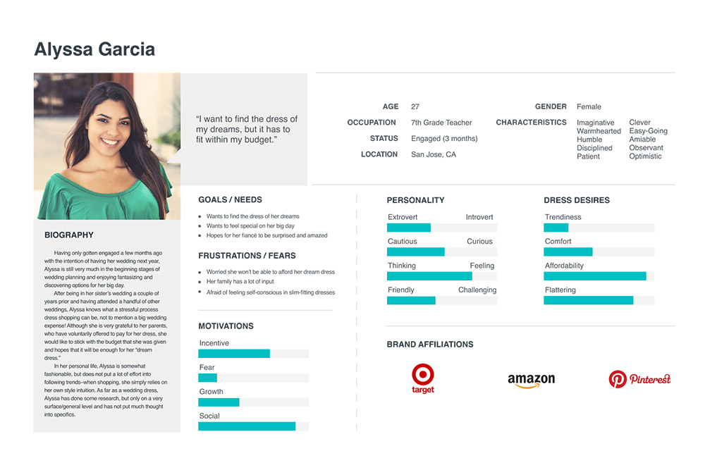
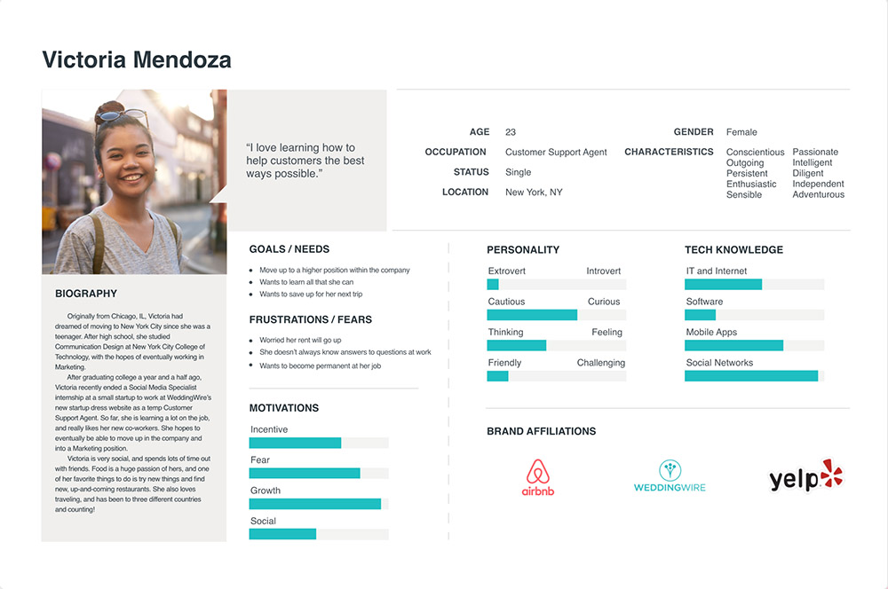
The first step I took in targeting this audience was creating user personas. Personas are archetypical users whose goals and characteristics represent the needs of a larger group of users, and help us reach a deep understanding of the target audience. By understanding the expectations, concerns and motivations of target users, it’s possible to design a product that will satisfy users needs and therefore be successful.
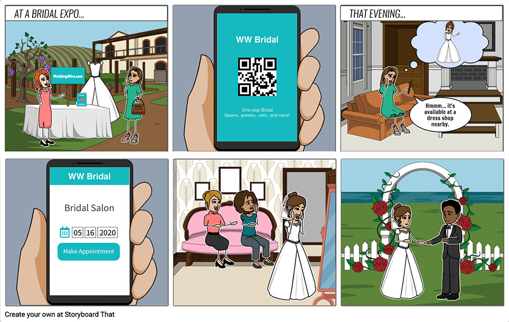
To further delve into the minds of these users, I decided that the next step was to create a storyboard, which communicates a scenario through images displayed in a sequence of panels that chronologically maps the story’s main events. In the world of UX, we use storyboards to provide additional context to our teams and stakeholders. Using images makes the story quick to understand at first glance and easy to remember.
Research Procedure
With the target users well-defined, the research process was able to begin. I decided on two methods of capturing qualitative data – in-person interviews, followed by remote user testing of the current WeddingWire.com website. This allowed me create a visual consolidation of common themes and attitudes that would guide the first draft wireframes.
01
Set the interview script
02
Interview participants
03
Create an Affinity Diagram to find common attitudes & themes
04
Have participants do free roam navigation on WeddingWire.com for a few minutes
05
Have participants card sort to find out which aspects are the most important to them
06
First draft wireframes
User Testing Highlight Reel
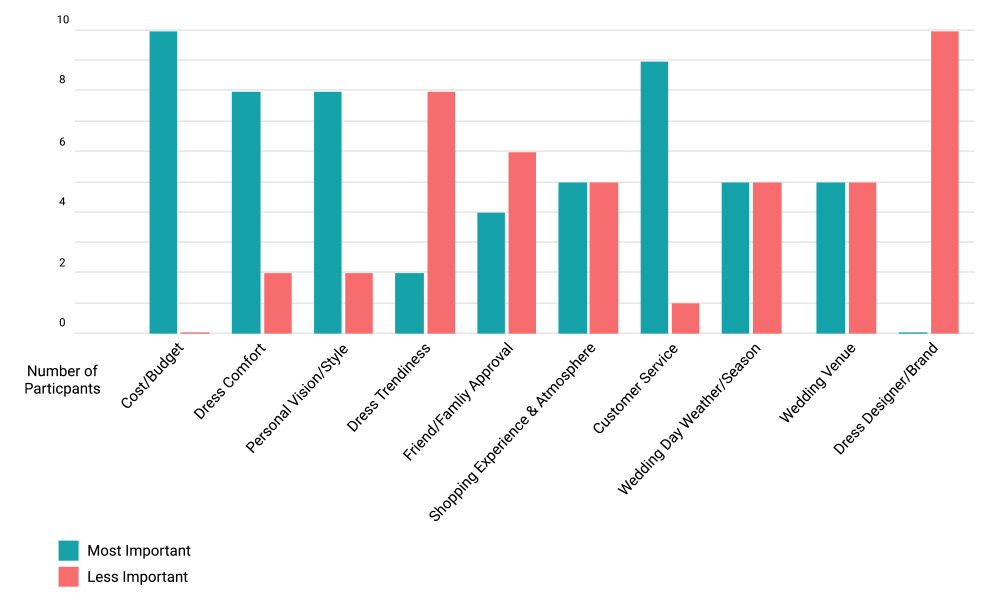
Wedding Dress Shopping Prioritization
Card sorting is a UX research method in which study participants group individual labels written on notecards according to criteria that make sense to them. This graph represents card sorting data collected during remote user testing. Users were asked to sort ten aspects of wedding dress shopping based on personal priorities.
Affinity Diagrams
An affinity diagram is used to organize information into groups of similar items—particularly useful when analyzing qualitative data or observations. With the use of an affinity diagram, we are one step closer to synthesizing qualitative data—from multiple sources—into one, actionable visual.
● Wedding Dress Shopping (PDF) – Results from in-person interviews
● WeddingWire (PDF) – Results from remote user testing
Research Findings
01
Budget
The budget is almost always the biggest factor of dress shopping priorities. Transparency with pricing helps to increase trust.
02
Efficiency
Users are looking for centralized, “one-stop-shop” tools to cut down on planning time
03
Opinions
Brides almost always prioritize their own opinions over other peoples’. They might have one or two people those opinions they value, but usually those people prioritize the bride’s opinion anyway.
04
Research
The more information brides know before shopping, the better experience they have. Brides who has been a bridesmaid and/or did extensive research tended to have better in-store experiences
05
High Pressure
Being a bride always comes with lots of pressure. What they want is a memorable, stress-free and fun experience.
06
Site Organization
The first thing users want to know is what the site/company is about & guidance on what to do. Well planned-out Information Architecture is key.
Wireframe & Prototype
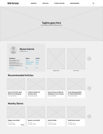
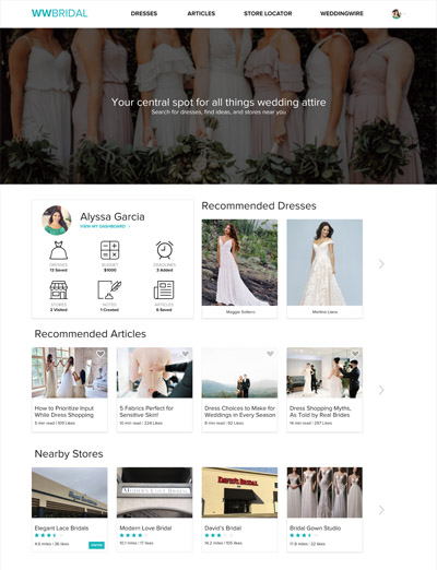
The features added in the wireframe and prototype were based on the users' priorities, needs and pain points discovered during the research process. Some of these include:
● Top banner with the site's name and tagline ● Different sections represented on the homepage ● Recommended dresses and articles, and nearby stores with the ability to save favorites and make notes. ● Personalized quick view dashboard visible on the homepage that leads to an expanded/detailed dashboard
Outcomes & Reflection
This project turned out to be really interesting and fun from a personal standpoint. Having been a millennial bride myself, I'm familiar with a lot of the challenges that wedding planning brings, and as a user experience designer, it's gratifying to work towards making it a better experience for others.
Ideally, this product will serve its users by providing an experience that is more immersive than a typical e-commerce site by acting as a system that addresses all aspects of wedding dress shopping that users would like to be able to control and synthesize from the comfort of their own homes.
A new technique I tried out in this case study was remote user testing through Userlytics, and it turned out to be easier and even more intuitive than I had imagined. I was blown away by the wide selection of options and features they have, and will definitely be using it again in the future.
