Apprenticeship.gov Design System
Synchronizing and refreshing the Figma library
Overview
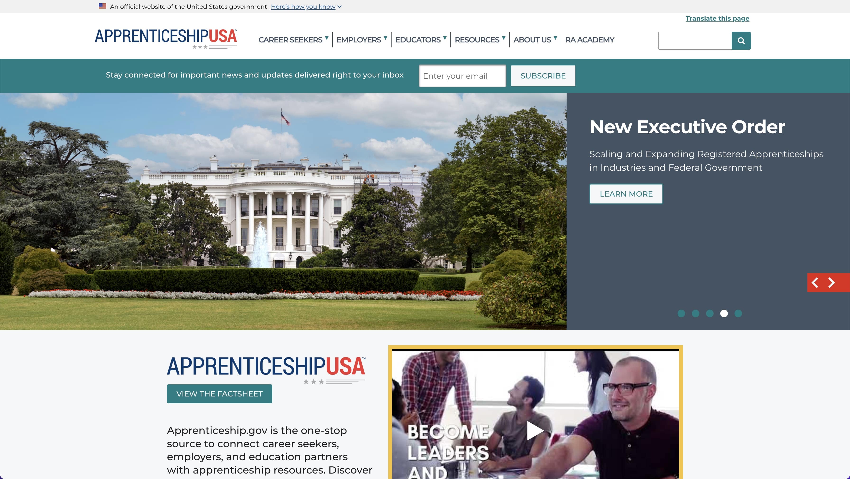
The Office of Apprenticeship (OA) is a federal program that is funded under the Department of Labor umbrella and aims to help employers start apprenticeship programs, and to connect career seekers, employers, and education partners with the wealth of resources available on the site.
Problem Statement
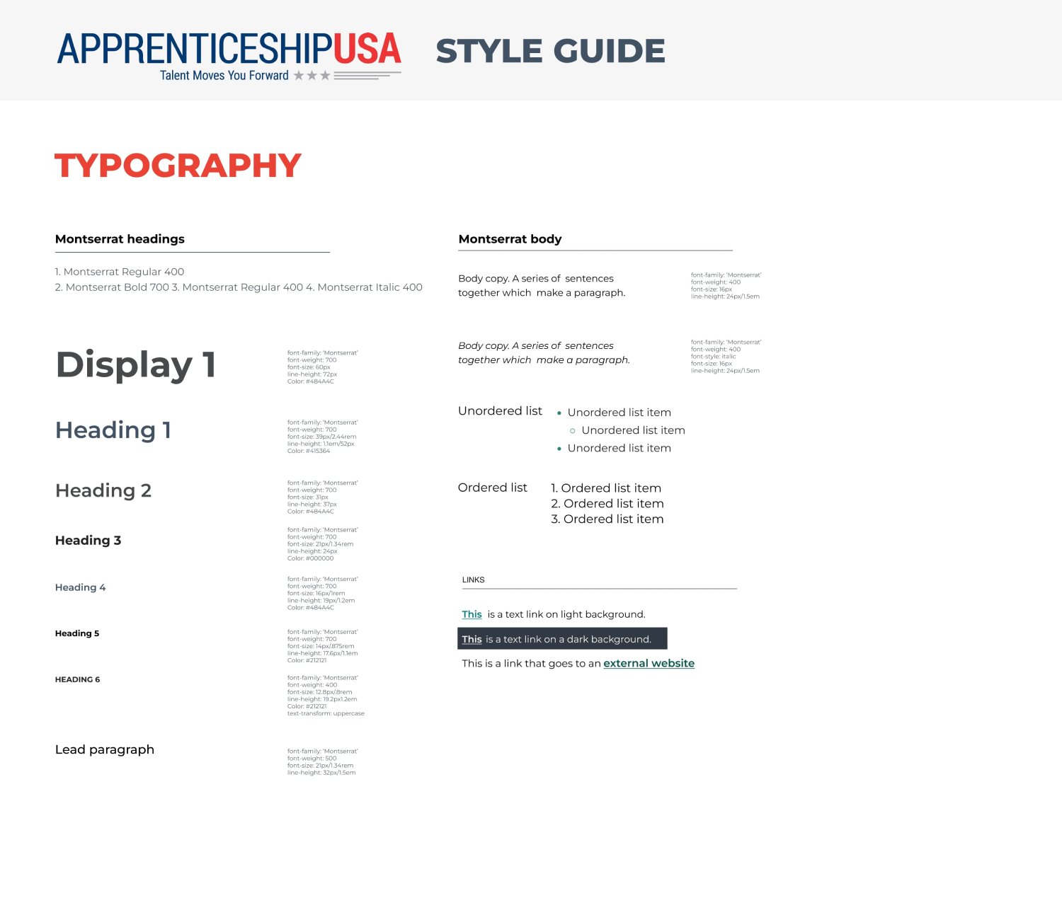
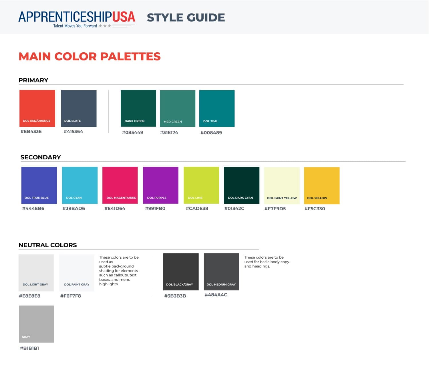
The web team had been working with a design system that was created several years ago by another designer. However, after not keeping it up to date for an extended period of time, it generally was not kept in sync with the live website, needed a lot of updating, and was therefore not very effective in providing the guidance that it could have. The team didn't have a lot of time or budget to allocate towards this project, so our efforts needed to be effective without needing a really deep dive.
Project Goals
● Update both the Design System and the Apprenticeship.gov website so that they match.
● Maintain the trendy and fun brand identity
● Reorganize the Design System so that it's easily usable by developers, sakeholders, other designers, and whoever else may need to reference or update it in the future.
● Deliverable: Updated Figma file
Guiding Question: How might we update both the OA style giude and the OA website so that they are in unison, in line with current 508 Compliance standards, and have a fresher look and feel?
Role & Responsibilities
● UI/UX Designer
Target Users / Audience Discovery
Apprenticeship.gov aims to target a wide range of users, from career seekers, employers, and education partners, with the main target group being the career seekers. There is a strong emphasis on giving the site a fun and trendy look and feel in order to appeal to and gain trust with that audience.
Procedure
01
Take Inventory
02
Make Adjustments in Figma
03
Make Adjustments on the Website
Outcomes & Reflection
It felt so good to get everything in sync and have a refreshed Design System that was usable and effective in the quick creation of mock-ups moving forward! The biggest challegne I faced while working on this was making sure to keep communication as smooth as possible. Sometimes while working on product teams, it can be tough to find a middle ground between all parties involved. In this case, there was a trend of wanting the design to match the website instead of the other way around because it would result in a quicker turnaround. In a lot of cases, I was really accommodating, keeping in mind the fact that this was always meant to be more of an MVP fast retouch project and not a full-blown redesign. There were a couple of scenarios when I would always push back:
● Whenever there was something that
needed to be updated to be 508 Compliant.
● Whenever something felt 'off' and didn't fit in with the rest of the design.
It was good practice in flexing my advocation muscles Overall, this was a successful project that ended up being short and sweet!


