Barnes & Noble
Analysis and breakdown of potential improvements
Overview
The purpose of this case study is to suggest improvements to the user interface for barnesandnoble.com (or bn.com) in order to create an enjoyable, almost nostalgic experience on the site that reminds users of the in-store atmosphere in order to encourage them to complete transactions and give the site repeat business. To do this, we’ll analyze some of the aesthetic aspects that could be changed to make these improvements.
Problem Statement
In the modern age of online shopping, it's especially important for traditional book retailers to shift and adapt their online strategies, which includes making the user experience a priority. Although this website has a lot of great features, I think that the homepage could use some redirected focus and changes in the information architecture. The current design seems to be trying to cram a lot into a small area of focus at the top, and I don’t believe that it is helping their cause. I also think that their branding could be better incorporated into this top section.
Project Goals
barnesandnoble.com is the web presence for the Barnes and Noble bookstore chain. The website states: “Barnes & Noble.com leverages the power of the Barnes & Noble brand to offer online customers the Web's premier destination for books, eBooks, magazines, toys & games, music, DVD and Blu-ray, and related products and services.”
Assumed main user goals for this website:
● Discover and/or find books, ebooks and other merchandise
● Look for sales and/or events
● Prepare themselves for in-store visits
Guiding Question: How might we update the more traditional aspects of the website while keeping the charming, nostalgic quality to improve our users’ book shopping experience?
Role & Responsibilities
● UX Strategist
● UX Researcher
● UI Designer
Target Users / Audience
The target users for project are individuals looking to access Barnes and Nobles' services online, whether to discover new material to buy in-store, or digital products to download.
Part A: Text Styles
Background Information
One of the most prominent features of the homepage upon first glance is that there are many different text-based elements, such as navigation menus, their logo, membership sign in, advertisements, etc. With all of these different elements comes an unusually wide 2 range of completely different styling. The examples mentioned are only from the top of the homepage, which is clearly an area on the site of great importance.
Problem
The problems with the text styles are that there are too many for one website, let alone to be visible all at the same time, and furthermore, some of these styles are too small from an accessibility standpoint. What’s especially concerning is that this problem exists in such a small, concentrated and important area like the top of the homepage. After investigating to see how many styles are present on the homepage, there are at least two different fonts, 7 different sizes, and 4 different colors, not including text that is baked into images. This area should be maximized as the most well thought-out area of the site, since it is likely to get a lot of traffic and be the landing spot for many users.
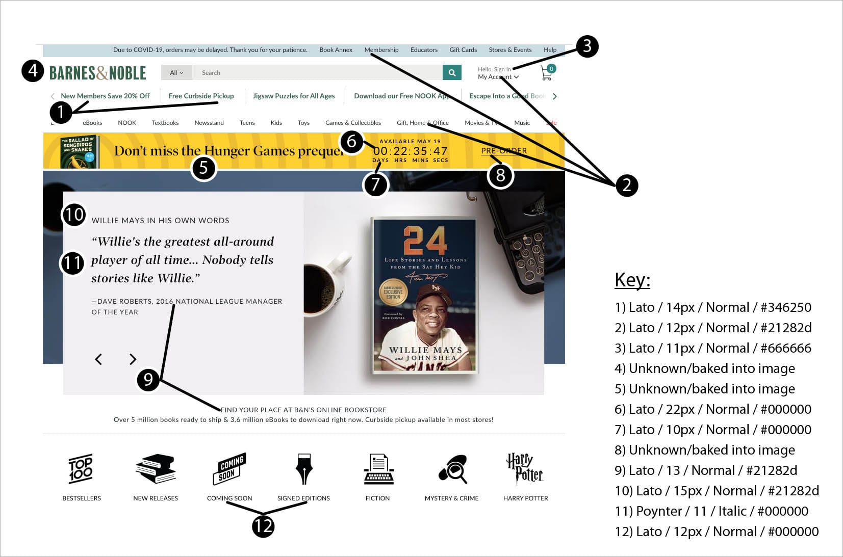
Fig. 1: Diagram showing observed different font styles on the Barnes and Noble homepage, captured using WhatFont plugin on Google Chrome
The current inconsistent wide range of text styles on the website is an issue because it reads as unstructured and unprofessional, and distracts users from finding the information they want. Another issue with some of these styles is that they are quite small, which is a big problem for web accessibility, especially for elements such as navigation, as seen in Figure 1.
Solution
For starters, although there is no official minimum text size for the web, there is a general consensus that 16px is a recommended minimum size. This size would act as a base minimum size to use for body text–definitely not for the navigation; menu items should stand out at a larger size. Overall, the number of styles should be pared down as much as the content allows, while making sure there is clear and deliberate hierarchy between elements (there will be more on that later in Part B). The number of styles currently present on the site should not be necessary, and especially not in such a small surface area.
Typography is a fundamental factor in web design, and plays a significant part in users’ ability to consume content, and affects the overall presence of the website. By planning out and executing a more deliberate, concise, legible and accessible set of styles for the text, users will have an easier time navigating and reading the content, making their overall experience more effective, efficient, and boost their perception of the brand as a whole.
Part B: Information Architecture
Background Information
Looking next at the information architecture, there are a few opportunities for improvement that stand out just on the homepage alone. As previously mentioned, there are a lot of different groups of elements happening in relatively small sections. For example, just at the top of the page (sans scrolling) there are three groups that all appear to be navigation, and four sections that have some sort of standout advertising message (Fig. 2). Additionally, as you scroll down the page, there are a lot of different sections of book categories, and a concern with this is that these categories are not differentiated enough.
Problem
Similar to Part A, Part B can be broken down into two sub-issues, both related to the information architecture. First, it’s a problem having as many different widgets/groups of elements at the top of the homepage as are currently there. As for the sections of book categories, the problem is that the categories have the tendency to blend together, as the separating elements (the spacing, title, and divider) are not currently providing enough separation.
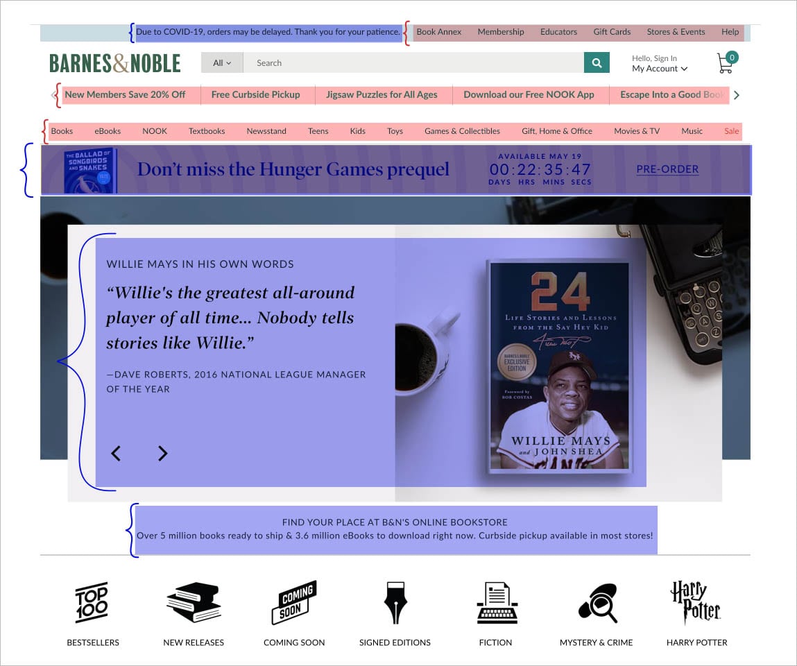
Fig. 2: Highlighted sections showing navigation menus (red), and important advertising messages (blue)
Since many of the elements cluttering the top portion of the homepage are text-based, this problem relates to Part A as well, because the existing different sections are using different text styling, which means that they are competing for attention. It’s also related because the amount of space being taken up by all of these widgets is partly responsible for the text size being too small. Not to mention the fact that there are multiple similar-looking navigation bars appears confusing and disorganized in itself.
The ill-divided book sections below are an issue as well because with the current layout, if a user isn’t paying close enough attention, the lack of separation might make the books appear to be in one large category, which isn’t encouraging for the users to keep scrolling, and could cause feature fatigue and ultimately lead to the loss of sales for the company.
Solution
For starters, although there is no official minimum text The most ideal way to approach cleaning up the different sections is to group navigation items as much as possible, possibly using a mega menu, that way the existing groups could still be kept, but organized into a more approachable and consolidated UI feature. Currently, there is already a mega menu (Fig. 3), so this could be utilized and expanded. Next, the site layout as a whole could have less padding on the right and left sides so that it is wider. This will help to make room for the necessary larger text sizes, as discussed in Part A.
As for condensing other elements, only the most important and absolutely necessary information should be kept, and/or some things should be moved to other areas of the site so as not to crowd and overwhelm any one area. For example, the Hunger Games prequel banner could be moved to be part of the carousel.
Finally, there are a couple of key options to improve the information architecture of the different book sections. The first option would be to simply tweak the UI so that the sections are more differentiated, and there are a lot of routes to go with this, (eg. any combination of: highlight the title and divider more, add more space in-between sections, alternate the background color of the sections, the list goes on) but the main idea is to make cosmetic UI changes. The other option is to add some kind of filtering feature to lead users to products based on their own specifications. However, depending on the business requirements, this may not be a possibility. It also has the potential to change the whole dynamic and purpose of showing the books from recommendations and encouraging discovery of new content to going straight to known tastes of the user.
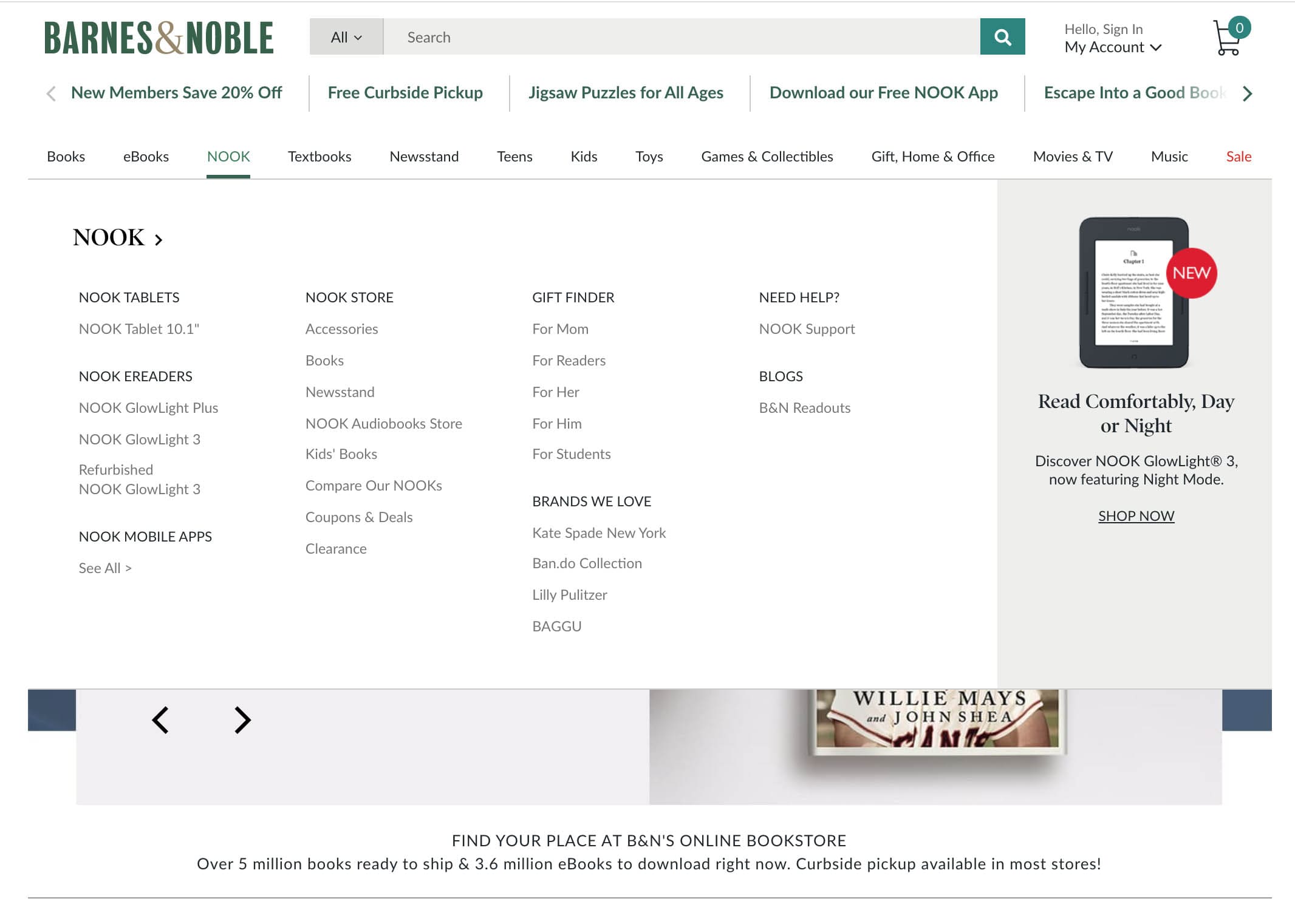
Fig. 3: Current Mega Menu on the Barnes and Noble website
In general, information architecture should always be a priority. In this case with the top of the homepage, if information and widgets are more concise and there isn’t an overwhelming number of elements visible at once, users have the best chance of absorbing what is shown, resulting in a more enjoyable, efficient, and much less overwhelming experience. Mega menus “ are an excellent design choice for accommodating a large number of options or for revealing lower-level site pages at a glance,” according to Nielsen Norman Group, and since there is already one on the page, it will be that much easier to implement the changes of adding the additional sections to it.
For the next sub-issue, a small A/B test was conducted showing a portion of the book categories from bn.com and a portion of hautelook.com . This website was chosen because it is also an e-commerce site that also has categories displayed on the homepage, but displayed quite differently. A few users were asked which they preferred, (Fig. 4) and they all chose the hautelook.com category UI, giving similar feedback all along the lines of how they liked being able to see the bigger pictures. From this, we can infer that larger, more concise elements that are free of visual “clutter” are more inviting to navigate through. The option of using a filtering feature, again, is highly dependent on what the business goals and requirements are. However, in the case that they are used, they are highly beneficial because the user’s specifications and references are prioritized and provide an element of instant gratification that navigating usually does not.
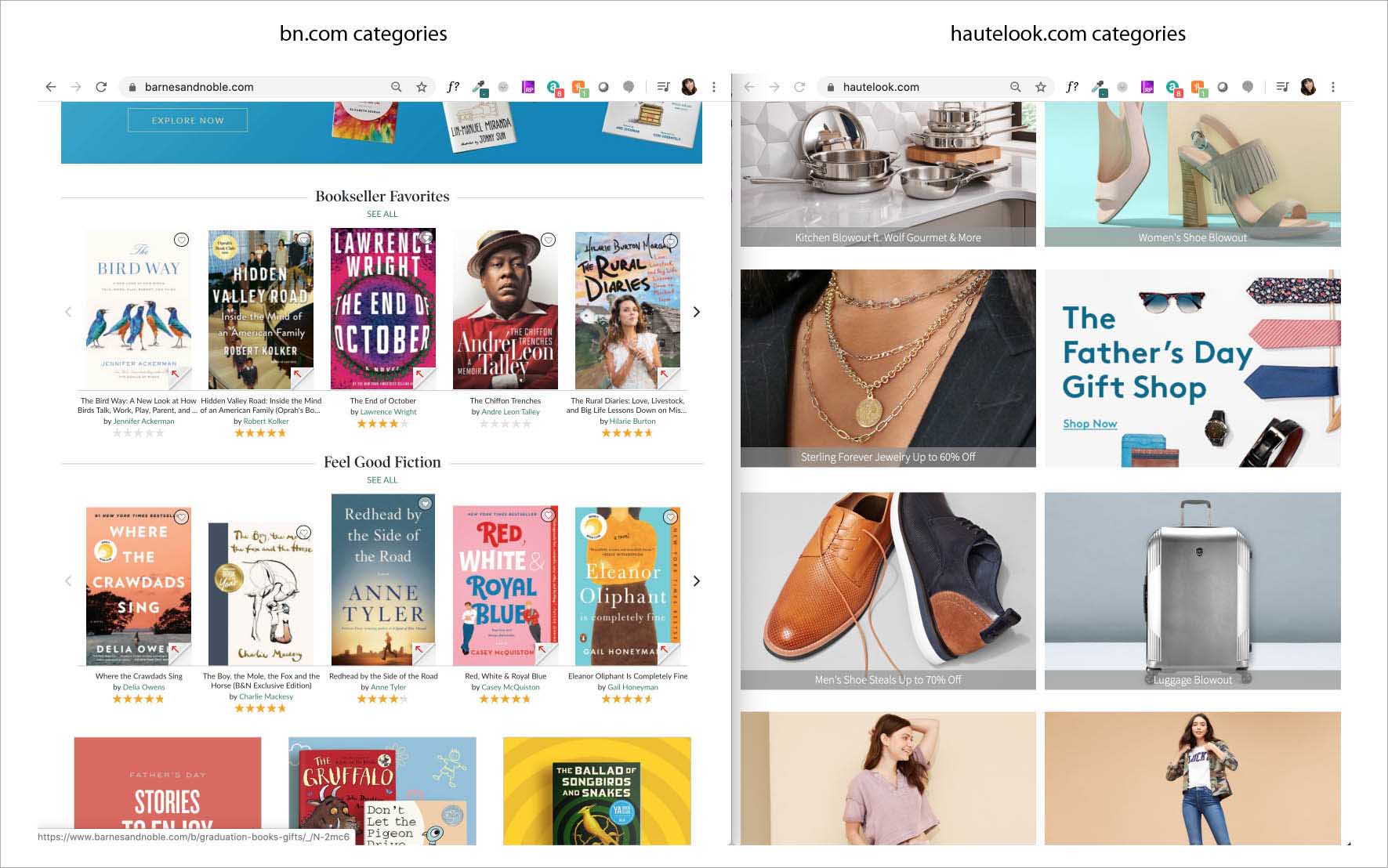
Fig. 4: Screenshot of what was presented to users for categorization preference A/B test
Part C: Carousel
Background Information
Finally, the Carousel is an excellent opportunity for revision because it is a clear focal point of the main landing spot on this website; it’s large, up front and center, and uses an eye-catching element of motion. However, if utilized incorrectly, the opportunity of this large and important feature may be lost on some users.
Problem
As mentioned in Part B, there is a lot of text going on at the top of the homepage, and the carousel is adding to that problem. Although the revisions mentioned in that section will definitely help in this aspect, the carousel requires special attention, as there is much more going on than just text alone since it’s such a visual element. The problem is not only that there is too much text on the carousel, but that the amount of time the carousel stops on each image is insufficient for the amount of content is available to absorb.
Carousel timing can be very tricky – move the slides too quickly and users won’t be able to see everything on them, but move them too slowly and users will be bored and move on. In this case, the combination of having too much content on each slide (especially too much text to read) and the current timing of the rotation runs the risk of users being frustrated by not being able to see all that they want to in time and possibly needing to go through the effort of going back.
Solution
There are a few suggestions in order to improve this feature. First, scale back as much as possible on the amount of text in each slide so that users are able to focus on the most important information. From a design standpoint, emphasizing the cover art as much as possible and moving the book quote closer to it should be a sufficient first impression to entice a user. Another option would be to only have the cover art, plus a background that complements it to make up for the rest of the space. Finally, in mobile view, auto-rotation should be turned off so that the users have full control of the widget. After two or three design options are mocked up, this would make a great candidate to run tests on to find what the optimal timing would be.
The same users from the A/B test mentioned previously were also asked to watch the carousel for 30 seconds or so, and then provide feedback on what they saw. None of the users felt like they had absorbed all the information seen on any given slide. A couple of these users mentioned that they were the most drawn to the cover of the book, and another said that he is a slow reader.
In this situation, book covers are a very large part of the marketing, and it’s a perfectly viable to use them to fulfill that purpose in this carousel widget by allowing them to shine as much as possible without much added text, as can be inferred from the user feedback. The other takeaway from the user feedback is that unfortunately, it is a possibility that some users could be frustrated or even feel like inadequate readers just based off of a webpart that moves too quickly. This is definitely not the ideal message for a bookstore to be sending to its customers.
The auto-rotate being turned off in mobile is a great option because relinquishing control of simple functions such as scrolling through slides helps to promote trust and engagement. In mobile view, the widget ends up being in the perfect positioning for them to do so.
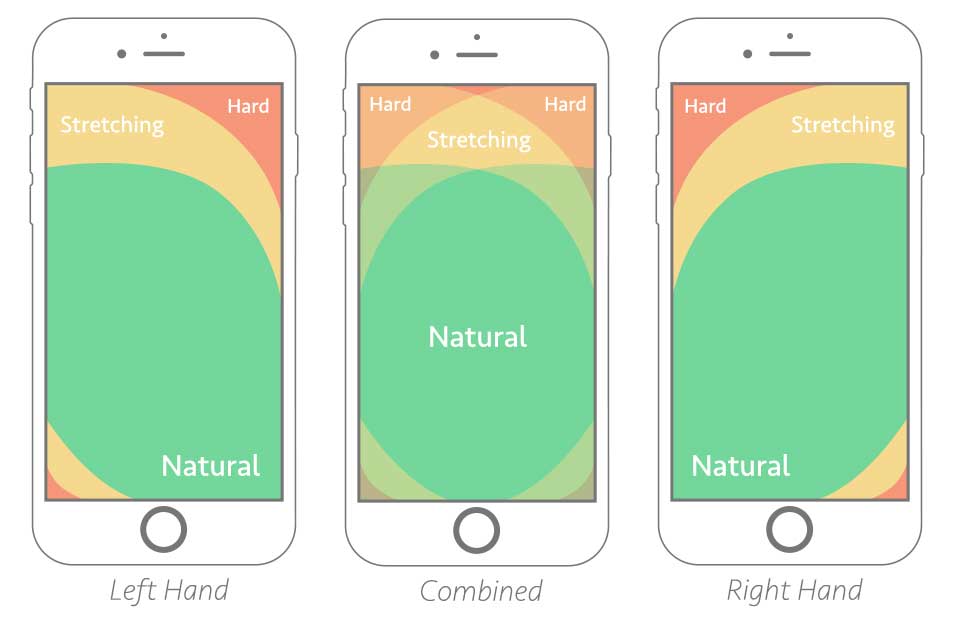
Fig. 5: The Thumb Zone diagram
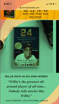
Fig. 6: The Thumb Zone diagram displayed on top of the carousel widget in mobile view
Wireframe & Prototype
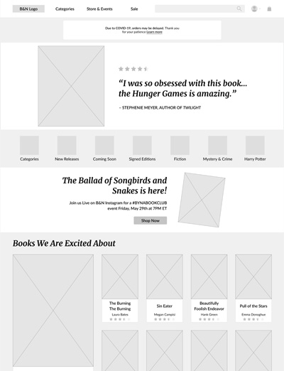
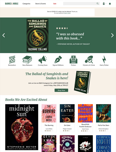
To summarize, paring down on the number of text styles would create a more structured and professional aesthetic, and make navigation easier for the users. Cleaning up the information architecture would create a much more natural flow and again, help to make improvements to the navigation. inally, since the carousel takes up such valuable real estate of the site, improving it in a way that encourages more users to engage with it has such great potential to make a big impact on sales. Fixing each of the aforementioned problems would add tremendous value to the uusability and overall experience of the site without requiring any sort of major overhaul. All of these changes are demonstrated in these mockups.
Outcomes & Reflection
Overall, I'm extremely pleased with the end result. It's clean, modernized, and I think that it accomplishes what I set out to do, in capturing some of the nostalgia of the store itself while improving the functionality and readability. The branding and color scheme could easily be lost in the display of all the colorful products, as it was originally. While my main focus was cleaning up the design, a byproduct of that effort is that the branding is much clearer and stronger. As you scroll down the page, I think it's held together especially by the animations above the featured articles, which are all on-theme.
